
The Sweet Bitter Cane Cover Evolution - a revolution
Once Sweet Bitter Cane was “finished” (an exact date is hard) and shipped off for the nit-picking line edit, it was time to think about the cover. In many ways, success and failure hinge on this. If the cover doesn’t visually evoke the story, all other efforts are lost. Added to this, in the digital age, if it’s not eye-catching as a postage stamp, it’s failed too. Gone are the days of the siren covers on booksellers’ shelves, but it does also have to work on a printed edition.
With all this in mind, with designer Ian Thomson, we started the quest to represent this story visually. The first thing to consider – what’s this novel about?
The novel involves Italian migrants brought to work on the sugarcane fields of Far North Queensland in Australia in the early twentieth century. But when they became a success, the local British Australian population became resentful and intolerant, the trade unions making it difficult for migrant workers to work. With the European rise of fascism, some Italian workers saw this as a means of support against the unions, which unleashed even more resentment. Once Italy entered WWII, the Australian Government classified the Italians as enemy aliens. The men were interned in concentration camps, disrupting their families and destroying their livelihoods.
But more specifically, Sweet Bitter Cane is the story of a young Italian woman, Amelia, who marries by proxy a man she’d never met, Italo, to escape the poverty of Italy after WWI. Together they run his plantation but Amelia, shocked by the challenges, is drawn into an affair with a local Irishman, her subsequent years forever impacted by the bitter mistakes she makes in those early, arduous months of her marriage.
History has largely ignored these women’s stories, especially the women who were also placed in concentration camps, accused of crimes like supporting fascism and aiding the Japanese in their quest to invade Australia. But at the heart of these accusations were often long-held grudges.
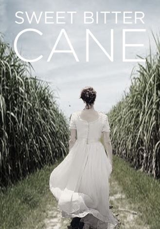
So the cover had to evoke the novel’s period, from the 1920s to the mid-1940s, the main character, Amelia, and, clearly, the main environment, the cane fields of Far North Queensland. Quickly, Ian mocked up a cover, deftly combining images pulled from the net. The best of these collages was this image.

The woman is walking quickly into the fields – was she purposefully walking to or away from someone? Clearly, in the mocked-up image the dress and hair were an earlier period, and this image wouldn’t work. But the collage was on the right track. But after scouring the net for images of a young woman, dressed in the 1920s or 30s, walking with pace away from the camera, we found none suitable. We then decided to stage and photograph this digitally created image.
After much problem solving, a photographer, John Bortolin, thought he could recreate it. Then the rush was on - the cane fields were soon to be harvested. A model, Ella King, would “play” Amelia. I didn’t want a face on the cover although there are many novels which, like movie posters, depict the faces of the major characters. A novel’s descriptions should evoke the characters in the reader’s mind, so the fact Ella didn’t look like Amelia in the face was okay.
But we needed a frock that would evoke the period, the major element of the photo that could do that. I rang a friend, Kate Zarboch, who owns a children’s fashion design company, Escargot Kids, who made suggestions of the type of frock we needed. I contacted fancy dress and theatre prop companies in the area near where the photo would be taken, but none had anything suitable. But then Kate sent me a photo of a dress in an op-shop. From the front, it was all wrong, but from the back, as we would have it in the image, it was perfect. Even the colour would look good in the field.

So the day came for the shoot. There was the most beautiful blue, clear sky. Over a hundred images were made of Ella walking, running or walking briskly between two fields. From these, we culled back to two images and then started working to arrange the text around the images.
To be brutally honest, the first few attempts were disheartening. It looked like a magazine cover. So we tried to dirty up the images with various filters, place the text in different fonts and manners but it still didn’t look right. It lacked drama.

Then Ian suggested we set fire to the cane. I was reluctant. It seemed cliché and reminded me of other covers. But he did a quick mock-up. BANG. All of a sudden there was great drama. And what was more, one of the most important parts of Amelia’s character came into the image. This was a woman with agency, strength, guts and determination. She wasn’t standing at a distance from the fire, her gaze passively turned away from it. Amelia walked into the fire of life. This was my character.
So, drum roll. Ta-da!
Here is the finished cover.

Once Sweet Bitter Cane was “finished” (an exact date is hard) and shipped off for the nit-picking line edit, it was time to think about the cover. In many ways, success and failure hinge on this. If the cover doesn’t visually evoke the story, all other efforts are lost. Added to this, in the digital age, if it’s not eye-catching as a postage stamp, it’s failed too. Gone are the days of the siren covers on booksellers’ shelves, but it does also have to work on a printed edition.
With all this in mind, with designer Ian Thomson, we started the quest to represent this story visually. The first thing to consider – what’s this novel about?
The novel involves Italian migrants brought to work on the sugarcane fields of Far North Queensland in Australia in the early twentieth century. But when they became a success, the local British Australian population became resentful and intolerant, the trade unions making it difficult for migrant workers to work. With the European rise of fascism, some Italian workers saw this as a means of support against the unions, which unleashed even more resentment. Once Italy entered WWII, the Australian Government classified the Italians as enemy aliens. The men were interned in concentration camps, disrupting their families and destroying their livelihoods.
But more specifically, Sweet Bitter Cane is the story of a young Italian woman, Amelia, who marries by proxy a man she’d never met, Italo, to escape the poverty of Italy after WWI. Together they run his plantation but Amelia, shocked by the challenges, is drawn into an affair with a local Irishman, her subsequent years forever impacted by the bitter mistakes she makes in those early, arduous months of her marriage.
History has largely ignored these women’s stories, especially the women who were also placed in concentration camps, accused of crimes like supporting fascism and aiding the Japanese in their quest to invade Australia. But at the heart of these accusations were often long-held grudges.
So the cover had to evoke the novel’s period, from the 1920s to the mid-1940s, the main character, Amelia, and, clearly, the main environment, the cane fields of Far North Queensland. Quickly, Ian mocked up a cover, deftly combining images pulled from the net. The best of these collages was this image.
The woman is walking quickly into the fields – was she purposefully walking to or away from someone? Clearly, in the mocked-up image the dress and hair were an earlier period, and this image wouldn’t work. But the collage was on the right track. But after scouring the net for images of a young woman, dressed in the 1920s or 30s, walking with pace away from the camera, we found none suitable. We then decided to stage and photograph this digitally created image.
After much problem solving, a photographer, John Bortolin, thought he could recreate it. Then the rush was on - the cane fields were soon to be harvested. A model, Ella King, would “play” Amelia. I didn’t want a face on the cover although there are many novels which, like movie posters, depict the faces of the major characters. A novel’s descriptions should evoke the characters in the reader’s mind, so the fact Ella didn’t look like Amelia in the face was okay.
But we needed a frock that would evoke the period, the major element of the photo that could do that. I rang a friend, Kate Zarboch, who owns a children’s fashion design company, Escargot Kids, who made suggestions of the type of frock we needed. I contacted fancy dress and theatre prop companies in the area near where the photo would be taken, but none had anything suitable. But then Kate sent me a photo of a dress in an op-shop. From the front, it was all wrong, but from the back, as we would have it in the image, it was perfect. Even the colour would look good in the field.

So the day came for the shoot. There was the most beautiful blue, clear sky. Over a hundred images were made of Ella walking, running or walking briskly between two fields. From these, we culled back to two images and then started working to arrange the text around the images.
To be brutally honest, the first few attempts were disheartening. It looked like a magazine cover. So we tried to dirty up the images with various filters, place the text in different fonts and manners but it still didn’t look right. It lacked drama.

So, drum roll. Ta-da!
Here is the finished cover.

Where to find the author:
Author’s Website: http://gsjohnston.com/
Twitter: https://twitter.com/GS_Johnston


No comments:
Post a Comment